Contents
Freeskier Magazine just released their list of what they feel are the top 10 best ski graphics of 2014. While it’s not the graphics that define a ski, it doesn’t hurt to have some rad looking sticks under your feet to help fuel your stoke and motivate some quality chair ride conversation.

We think Ski Logik should have made it in there somewhere with their sexy wooden inlays or perhaps the 4FRNT CRJ. But it’s hard to narrow it down to just 10 of the best ski graphics when so many are so good looking. How would you define your top 10 best ski graphics of 2014? How about all time best graphics? Or should graphics even be a part of the equation?
10 Best Ski Graphics of 2014:
1. 4FRNT YLE
2. APO Sammy C
3. Armada TSTw
4. Armada AR7
5. Atomic Infamous
6. K2 Shreditor 120 “The Pettitor”
7. Line Mr. Pollard’s Opus
8. Line Sick Day 125
9. Nordica Patron

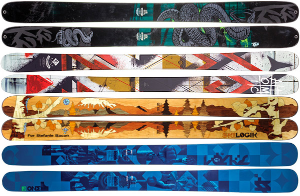


I kind of prefer the pop art graphic-i-ness of this yr’s skis. I’m just glad we’ve moved beyond the scary, heavy metal art work of the past couple yrs. Too scary!
I wonder, considering the apparent bias toward busy pop art design, whether the judge is a graphics designer/artist or a skier. I think a critique of graphics should be the former. these skis do appeal mostly to the demographics of younger males, park oriented, symmetrical construction, etc.