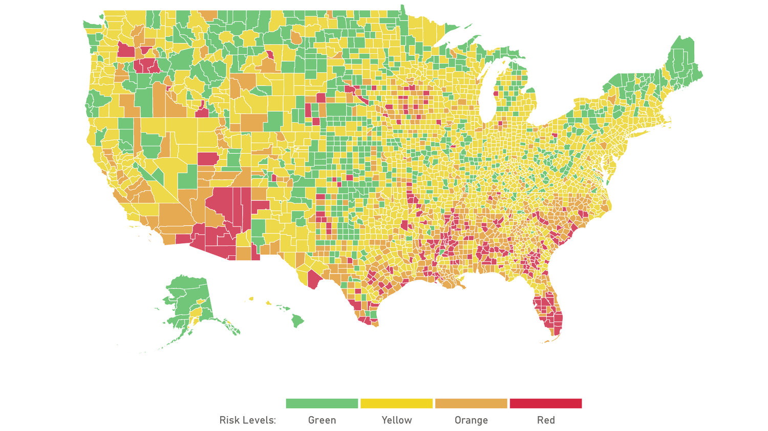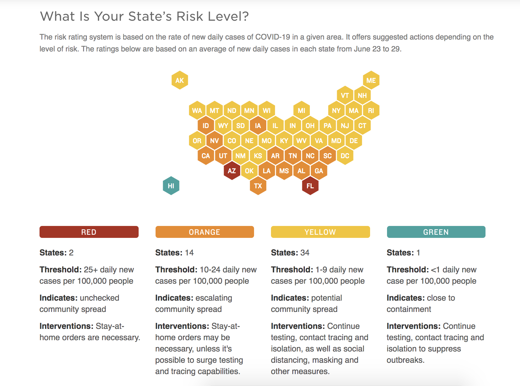
Harvard Global Health Institute/Microsoft AI/Screenshot by SnowBrains.
How bad is the coronavirus outbreak in your county, really?
With this new interactive map and dashboard, you can track community spread county by county and see if you’re in a green, yellow, orange, or red threat level area.

Currently, there are two states with a ‘red’ danger level: Arizona and Florida.
And one state in the ‘green:’ Hawaii.
To learn more about community spread of COVID-19, click here.


